I am part of affiliate program(s), and may receive a small commission from purchases you make through my links, at no additional cost to you.
It’s a great way to support me, so thank you!
See the full disclosure.
Do a value study with crayons.
Squint and guess which crayon is darker, then paint them out lightest to darkest (not intense or vibrant, but light and dark). Then take a photo and convert it to black and white and see how you did.

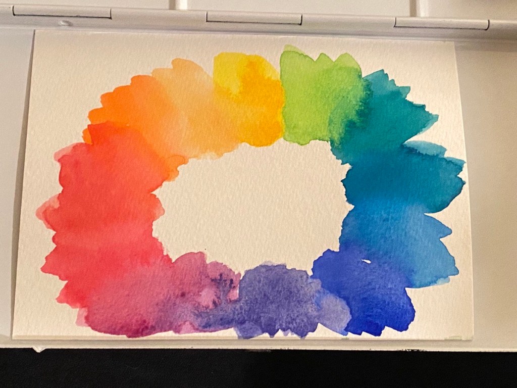
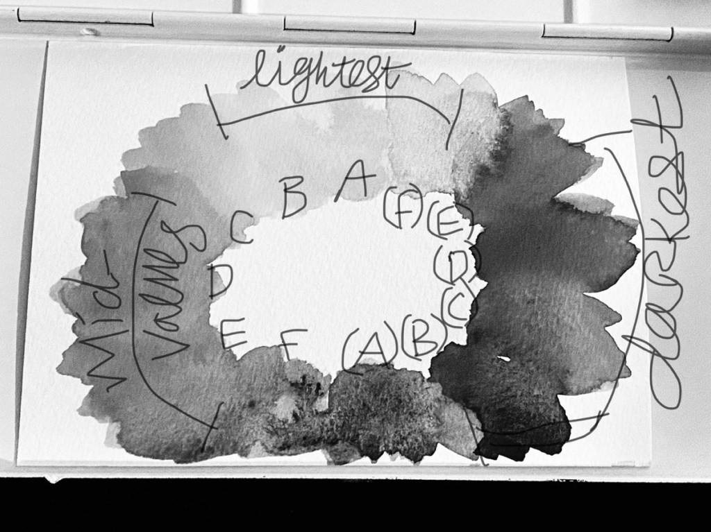
At their strongest intensity/saturation, some colors are darker than others. Generally yellow will be the lightest, and will never get darker than blue at its darkest.

Now the question is, can you paint a picture in black and white using color; that is paint in color so it will look good when converted to black and white.
If you can learn to do this, you will master painting with good values in watercolor.
I was always fascinated by which of my photos from a photoshoot would look better in black and white, and which lost something when converted to black and white. I always wanted to be able to do a photoshoot in color and know I got a few good black and whites that I could convert from color into black and white later.
This concept has translated over to painting. I never got there in photography, but maybe I’ll get there in painting; making a picture in color that will look good converted to black and white. The ultimate test of values and good contrast in painting. They say if it looks good in black and white, it’ll look good in color. That’s generally true but I can’t paint in black and white and covert to color (not really, not easily).
I’ve found that yellow is the lightest, followed by the colors with dominate yellow, like yellow green and orange, then reds seem to be mid tone, followed by blue being darkest, meaning that I suppose if a color has blue it will darken, making greens mid value, to dark when they are blue dominate, and blue or blue purple being the darkest (all at full saturation, for relatively equal comparison).

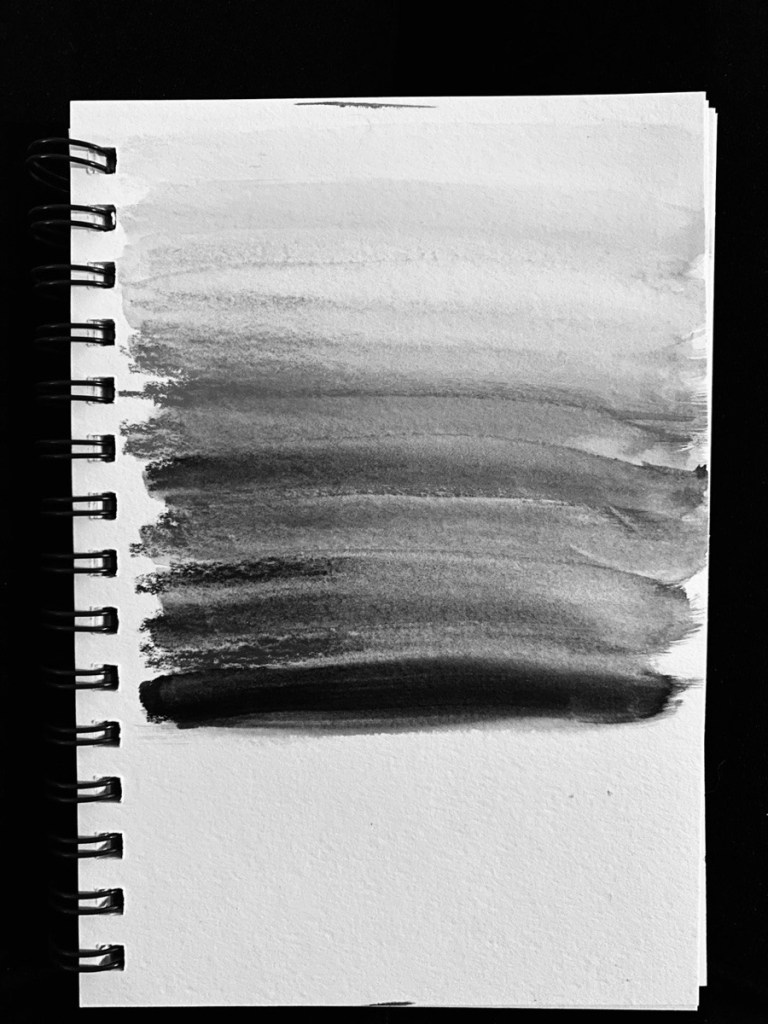
I then spread those watercolor crayons out with water for the bigger picture.
This explains why a photo with a red door and green bushes or something, doesn’t translate well to black and white. Green and red are close in value. Something with yellow and blue would have better contrast.

She has a free color theory class I recommend watching twice.
I was also watching this guy on YouTube and his videos were really helpful with color too. It’s digital color rather than watercolor, but still applies.
Be aware there’s a difference between learning painting color theory and digital. I find as you paint, color becomes more intuitive, but digital color is harder to adjust, as you need to use a slider rather than mix paint for yourself. I feel a bit more removed from the process; and that digital is more subjective due to different monitors, than physical color in painting on paper when learning color theory.
These are my initial findings. The idea of squinting and testing a color against a white or gray surface to determine its value came from this lady on YouTube. She explained it really well.
And Liron’s watercolor course is what got me into my deep dive of values. He has a youtube video on how to do a value scale with your different colors. (His course is only found in the description of his newer youtube videos).
I’ll have to do more experiments and let it percolate a bit more, but isn’t this interesting? The Value of Color.
Megan
- Ps. I also found these two videos helpful:
- https://youtube.com/watch?v=TfAZt3O0sLY&feature=share
- https://youtu.be/u5AnzLg1HxY
- And don’t forget to check out Oto’s Color Theory class 🙂
You can get the Neocolor 2 from Caran D’Ache on Amazon. This is the 15 set, they also have an adorable 10 set in the cutest tin.
If you’re interested in color, you can check out another post I did about my most used bijou box colors.
